The healthkeeper app was the final deliverable of a bootcamp project from 2020. The prompt was to create an app that solved a human need. I served as a researcher and designer in the group of 5, and our goal was to create an app that helps people organize health information.
As a type-1 diabetic, this project was personal in nature as I am often overwhelmed with tracking my health information. I've re-revisted the designs and have updated the app to have a more modern look.
Researcher & Designer
Miro, Trello, Figma, Flowmapp
Utilizing the design thinking process, the team wanted understand people’s general pain points while managing and organizing their health information. The team began by talking about our own frustrations with healthcare and jumped into trying to identify potential features. I geared us away from creating solutions and towards open-ended discovery and research.
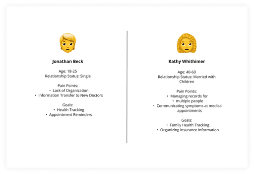
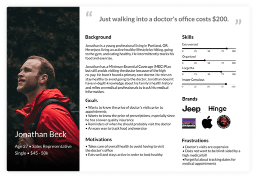
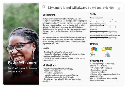
We deemed it important that the app address a wide-range of health situations, so we began by identifying two potential users and created proto-personas:
Individual - Single, Millennial
Parent or Caregiver - Head of Household
Jonathan and Kathy, proto-personas created to guide the project.
The interviews ran approximately half an hour and included 10 questions. In addition to asking how people organized their health information (Ex. doctor’s information, insurance, appointments, prescriptions), we wanted to understand if people tracked and logged their health.
Key Interview Questions
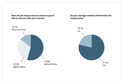
How do you keep track of concerns you'd like to discuss with your doctor?
How do you keep track of medical-related information (i.e. medical history, doctor’s appointments, insurance, etc.)?
Do you manage medical information for anyone else?
Insights
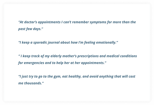
Quotes from interviews and results of online survey.
We learned that both individuals and caregivers struggle to stay organized when it comes to their healthcare. Doctors, prescriptions and insurance tend to change, and it is often hard to keep track of this information. When visiting the doctor, people rely on their memory to communicate their symptoms. For those responsible for the health information of others, it is even more of a struggle to keep information organized.
Using the data from our interviews and survey results, we created affinity diagrams to guide persona insight and user persona creation.
User personas created based on interviews and surveys.
Problem Statement
How might we create a centralized system for individuals and families to track and manage their health information and needs?
Adults need a better way to store their health history, track ongoing symptoms and document their concerns in order to better understand and address their health needs and the health needs of others.
We believe that creating a way to track, organize, and securely store health information in one application will empower adults to take better care of themselves and their families.
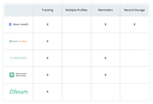
At the time, we found apps that let users track and log their health but weren’t able to find apps that also let users set up multiple profiles or store their medical and health history and information.
Revisiting these designs, I discovered onerecord, an app that apps that provided users with multi-profile capabilities and record storage.
Competative analysis conducted to guide app creation.
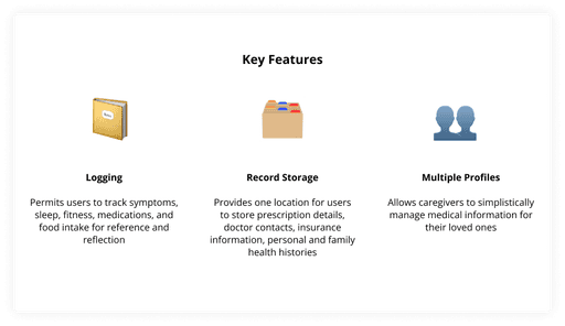
Using the “I Like, I Wish, What If” method and a feature prioritization matrix, we determined the key features that we would be able to deliver to help Kathy and Jonathan achieve their goals of tracking, organizing, and securely store health information in a central location.
These features provide both Jonathan and Kathy with the flexibility to use the app in the way that most fits their needs at any given time - whether it’s in their daily lives, when they fill out medical forms at the doctor's office, or are managing the health of others.
Key features identified for the app: Logging, Record Storage, and Multiple Profiles
This iteration and prototypes allows users to track their medicine, sleep, exercise, prescriptions, food & water. We hope that future iterations allow users to track even more! Users can also store their current health information (ex. doctors, insurance, and prescriptions) as well as their family’s health history.
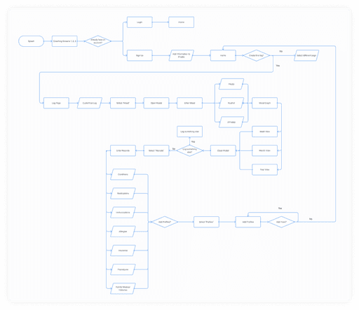
User flow of sign up process.
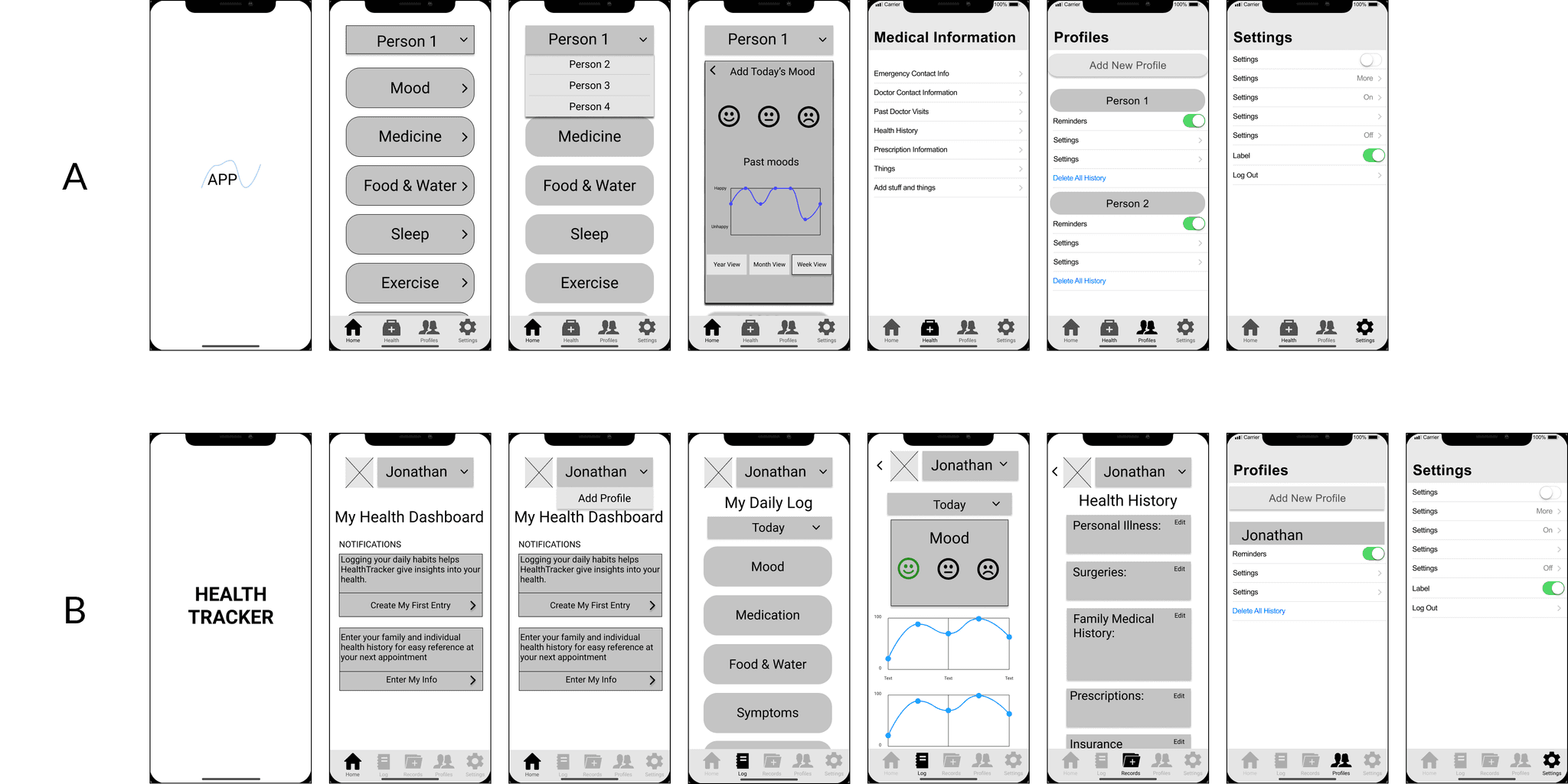
Low-fidelity designs for A/B testing.
We were interested to see which features in the A/B prototypes would best facilitate the following:
Users can easily sign up/log in and navigate to the dashboard.
Users can locate where they would input their or their family members’ personal health history.
Users know where to track their daily moods.
Usability Testing
We conducted 10 usability tests (5 of each prototype) and asked users to do the following:
Task 1: Sign up and navigate to the dashboard
Task 2: Locate where to input medical history
Task 3: Locate where to add user
Insights
Overall, participants preferred the customization features of Prototype A.
The “My Health Dashboard” feature allowed users to use the app in ways that best suit them instead of forcing them to use the log feature when login.
That being said, users expressed confusion around the wording on the coaching screens and the text on the dashboard.
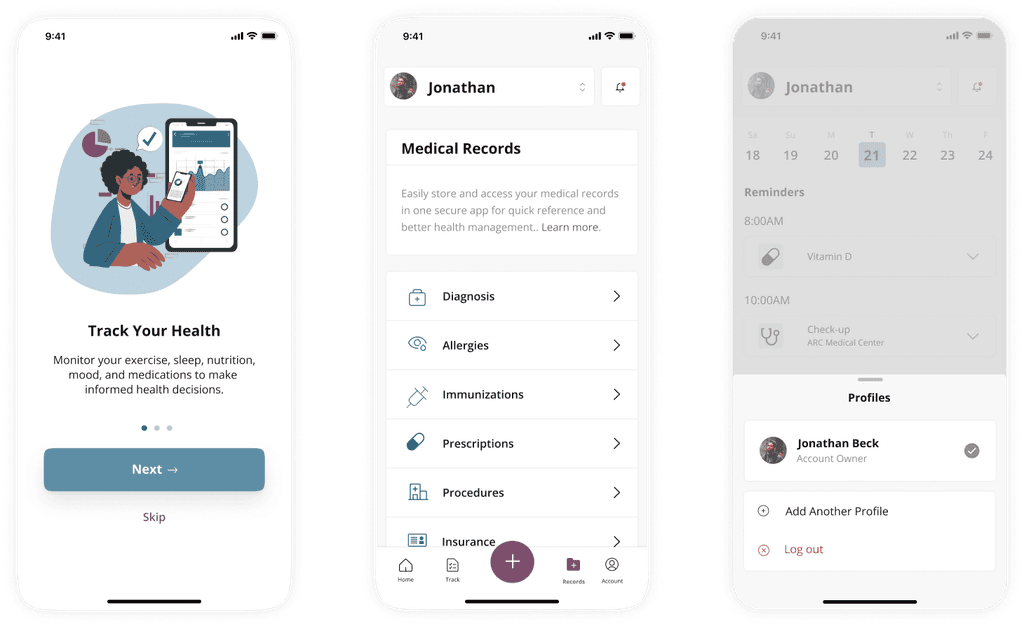
I've updated the designs by creating a new color scheme and using more modern designs.
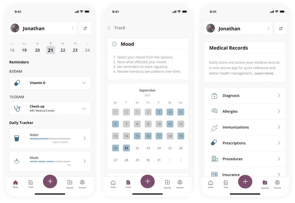
High-level overview of design changes made.
I began by updating the welcome screens from the illustrations I created 😅, to icons and illustrations available online. The were Icon made by Storyset from www.flaticon.com.
Updated Welcome screens.
I kept the blue/gray color as the primary color and swapped the bubblegum pink for a raspberry pink, which met accessibility standards. The simple change of color improved the over feel of the app.
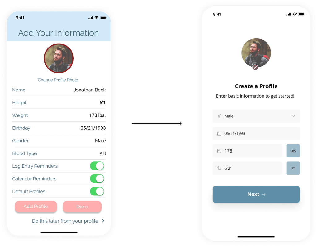
Updated Profile Creation screen.
I modernized the design for switching between profiles - which is key feature of the app. I included the ability to log out, which was not previously included.
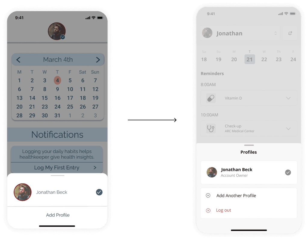
Updated Swith Profiles screen.
The previous design had had tracking in 2 places - the home page and the loge screen. Looking back on it, this was a poor design because it tool up "real estate" within the app. I moved the logging feature to the Log tab and updated the home page to provide users with reminders and insights.
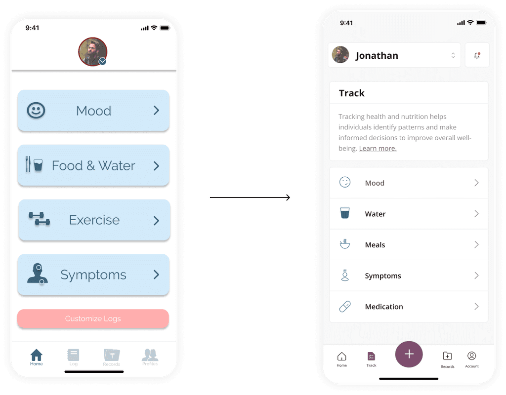
Updated Log screen.
I updated the home page so that users were immediately shown their calendar and reminders, without having to click into the individual category.
I also designed the records page, another key feature, which we did not design in the first iteration.
Additional Designs: Home screen, Log screen, and Records screen.
When I originally worked on this product, I learned how to prioritize tasks and learned to let go of ideas and ego for sake of users.
Working on health management app was extremely challenging, especially since their are security regulations we were note aware of in this space.
We discussed future iterations, including adding premium features, sharing features, and tracking for specific chronic conditions. We also discussed expanding reminders including, appointments, which I incorporated into the redesign.
Taking a second look at this project with more experience was eye-opening.
Gaps and weaknesses in the user experience and design jumped out to me in ways I wasn't able to see previously. For example, I thought healthkeeper would be revolutionary because it provided a multi-profile health management capabilities. I learned while revisiting that is not the case, and that the app onerecord offers the same capabilities.
Revisiting the previous designs was very humbling and equally rewarding.
